Project: Branding
Role: Art Direction, Design
Creative Director: Ryan Grosman
Date: 2022
The primary objective was to create a look and name that unmistakably connected it to PHL in a project centred around developing a distinct identity for the Team Sales group within the PHL umbrella.
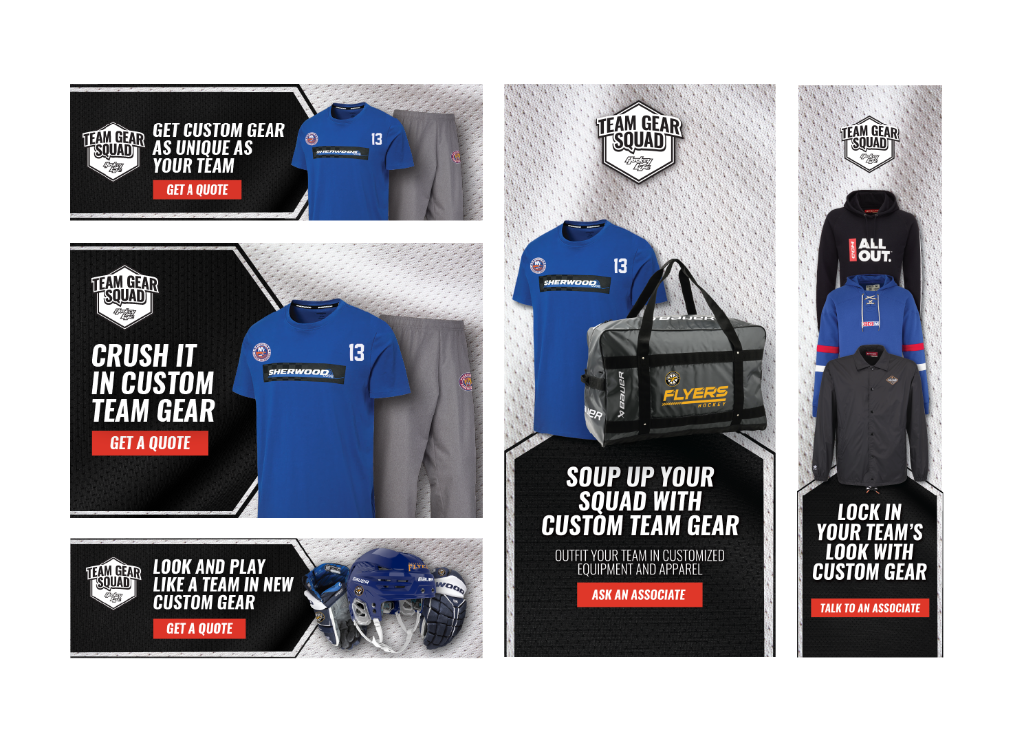
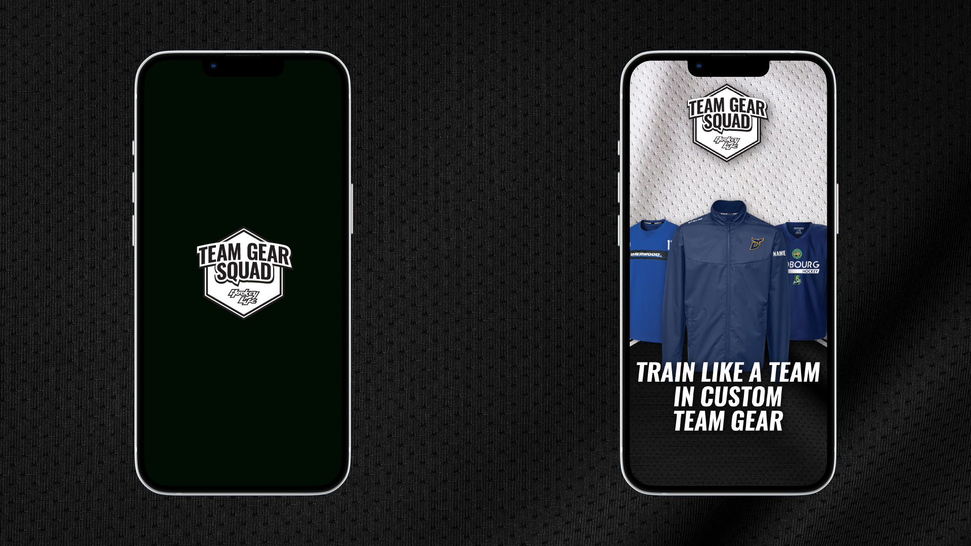
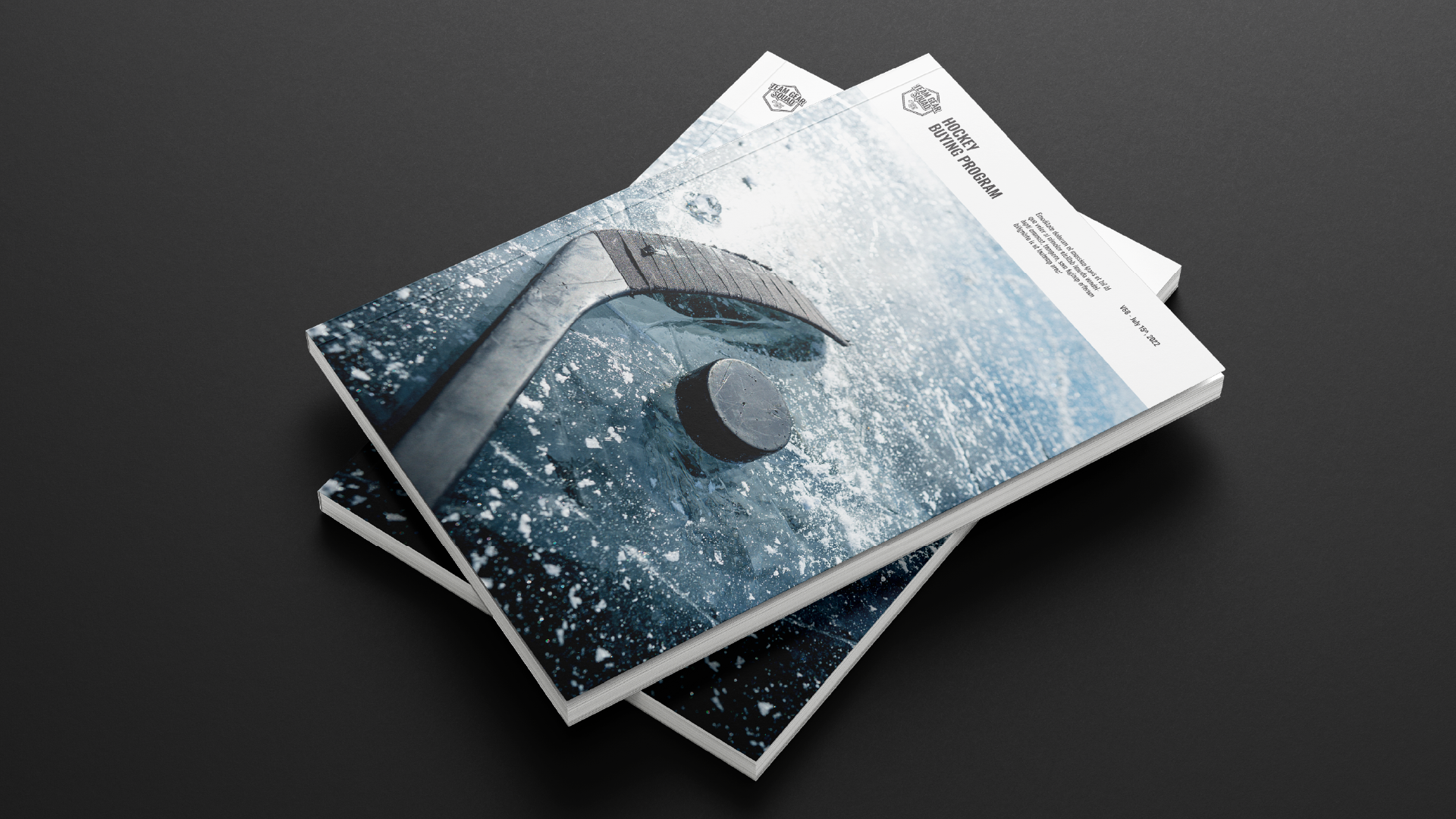
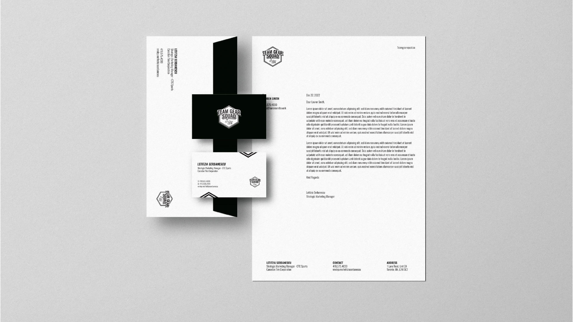
This also includes designing an ownable logo. Furthermore, the task extended to creating copy and visuals for Team Gear Squad (TGS) for various advertising media. The challenge lay in ensuring the designs could adapt to different mediums and that the copy should reflect services offered by TGS. This case study highlights brand identity development, logo design, and content creation to address the diverse needs of the client.
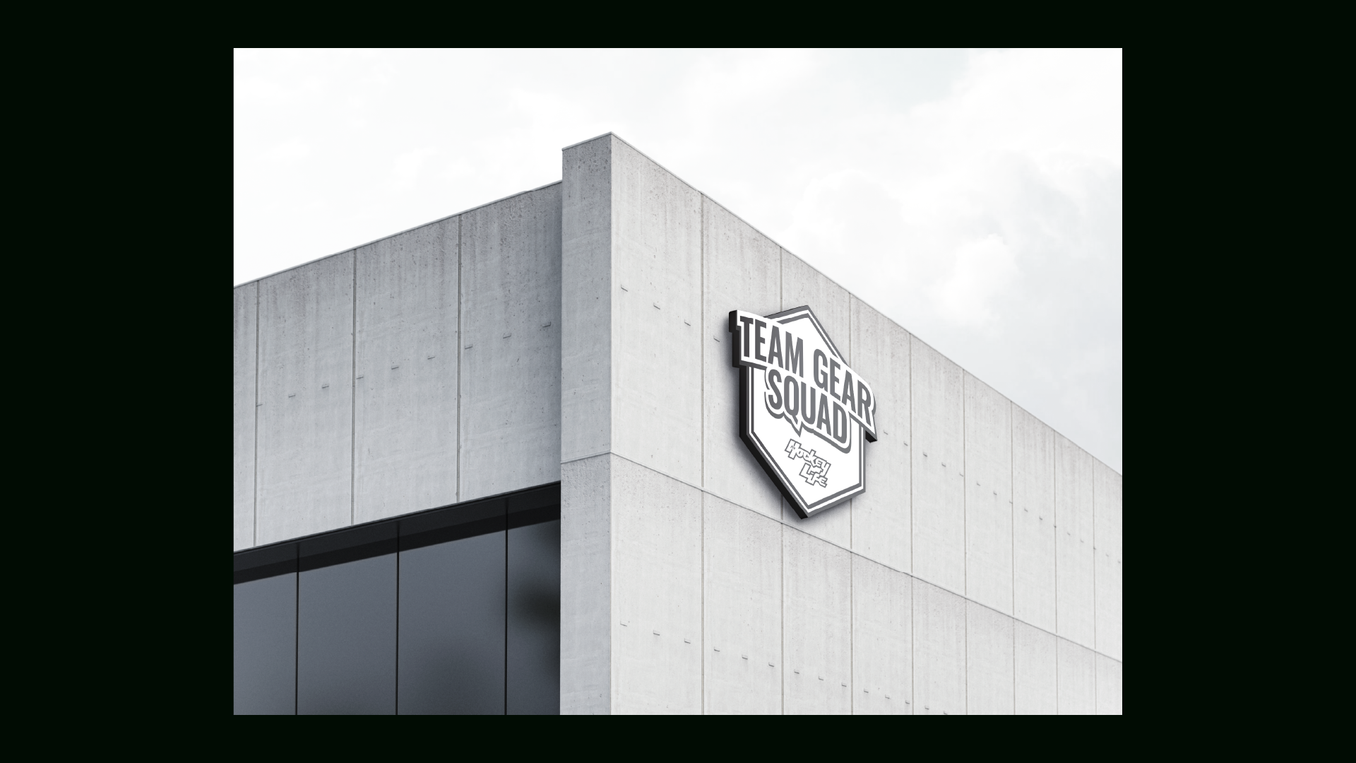
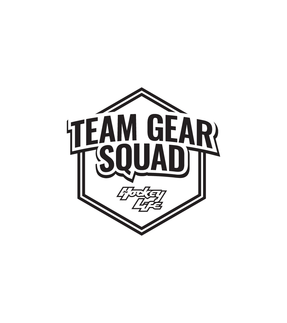
Our most recognizable element, the new TGS logo, uses a similar outline as the PHL logo but with a drop shadow for extra dimension.
The polygon badge gives a sports team a look and feel.
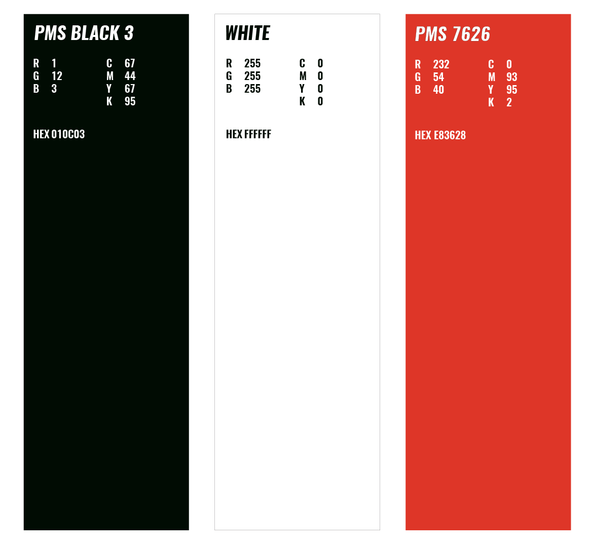
The primary brand colours for Pro Hockey Life are black and white. The values for these approved brand colours are illustrated above. Red is to be used as an accent secondary colour on print and digital applications.